
As someone who’s seriously into sports and active lifestyles, I found myself using an app with a concept I genuinely loved, but the user experience was really frustrating. That’s what prompted me to undertake a full redesign. Here’s what came out of it:
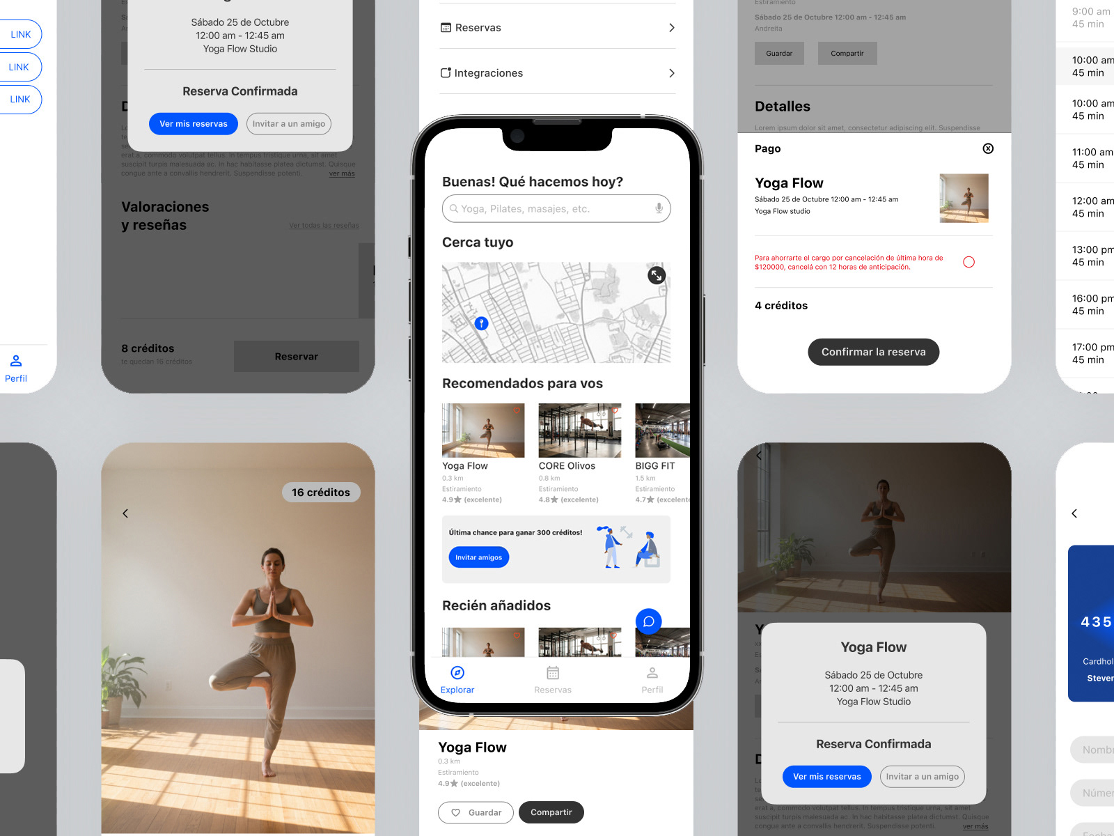
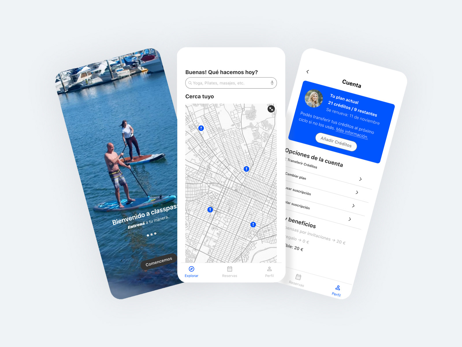
After noticing a high volume of negative user reviews around unexpected renewals, unclear cancellation steps, and missing notifications, I set out to redesign the cancellation flow to be clear, honest, and user-first. To ground the work in real product constraints, I proactively reached out to a Product Manager to understand the broader system logic, business rules, and edge cases, ensuring the redesign was realistic and scalable, not just visually improved.
The redesigned flow simplifies decision-making, clearly communicates renewal timing, and removes dark-pattern friction that previously led to user frustration. The goal was not to retain users at all costs, but to build trust through transparency.
In parallel, I introduced a Partner section within the same app, unifying the experience for users and partners instead of splitting them across disconnected touchpoints. This helped create a more cohesive product ecosystem while maintaining clear role separation.
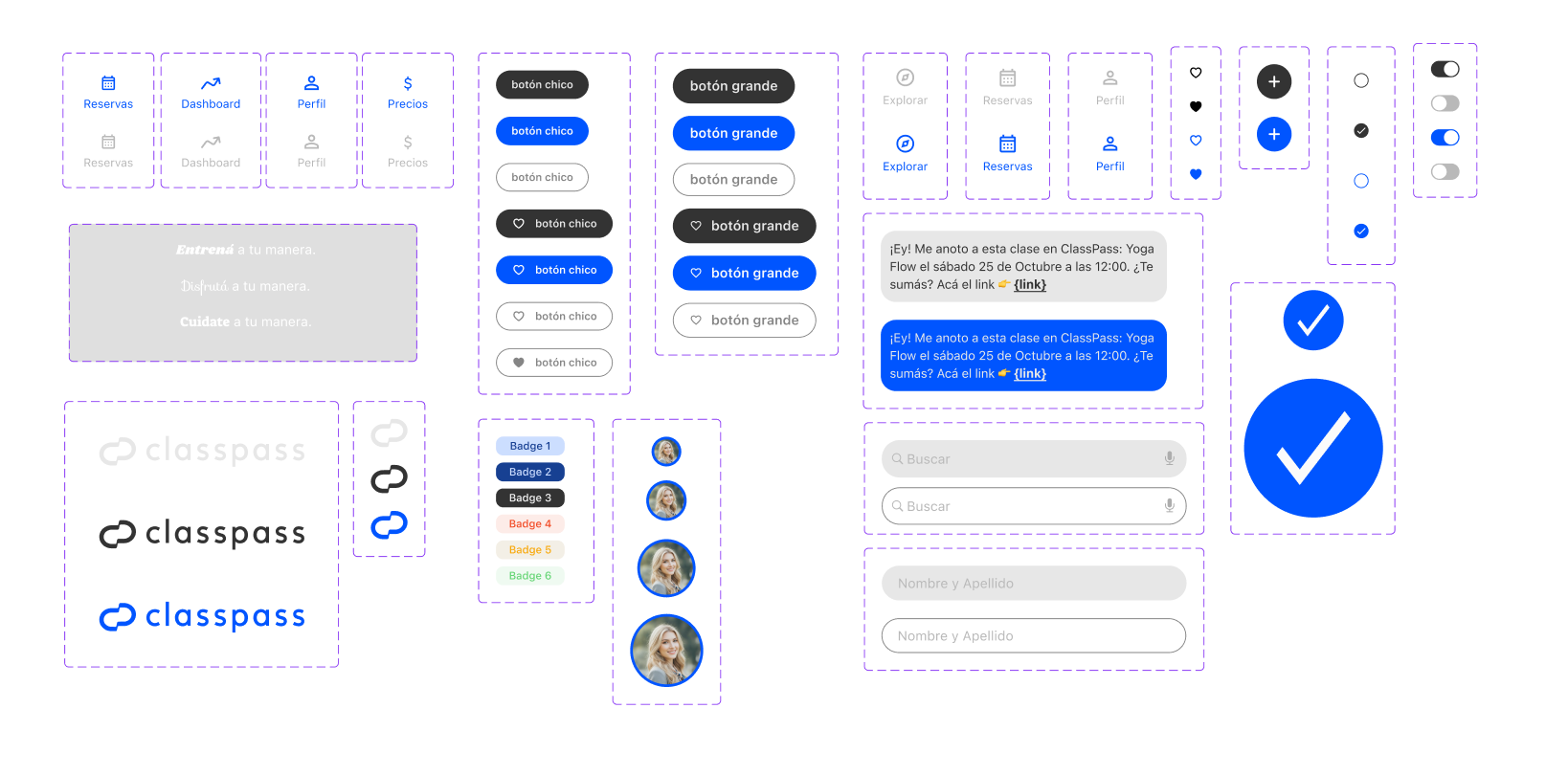
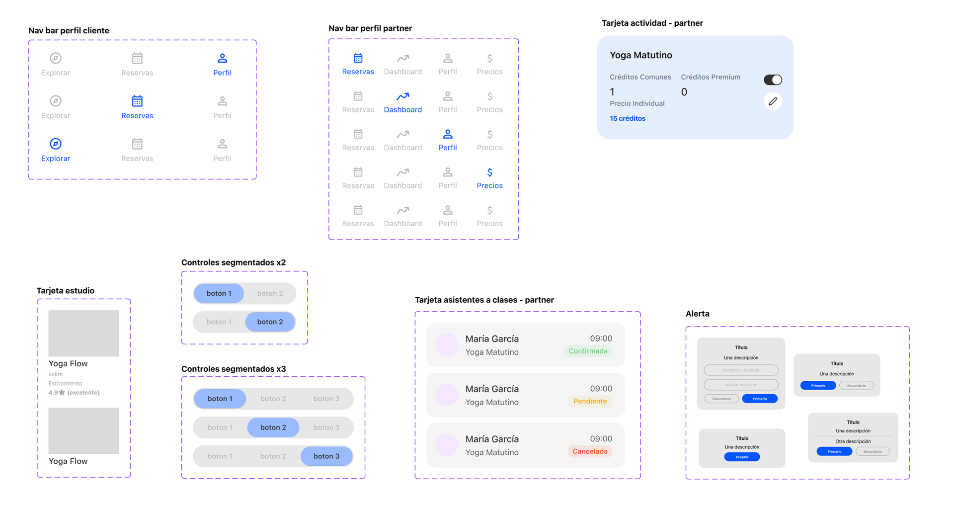
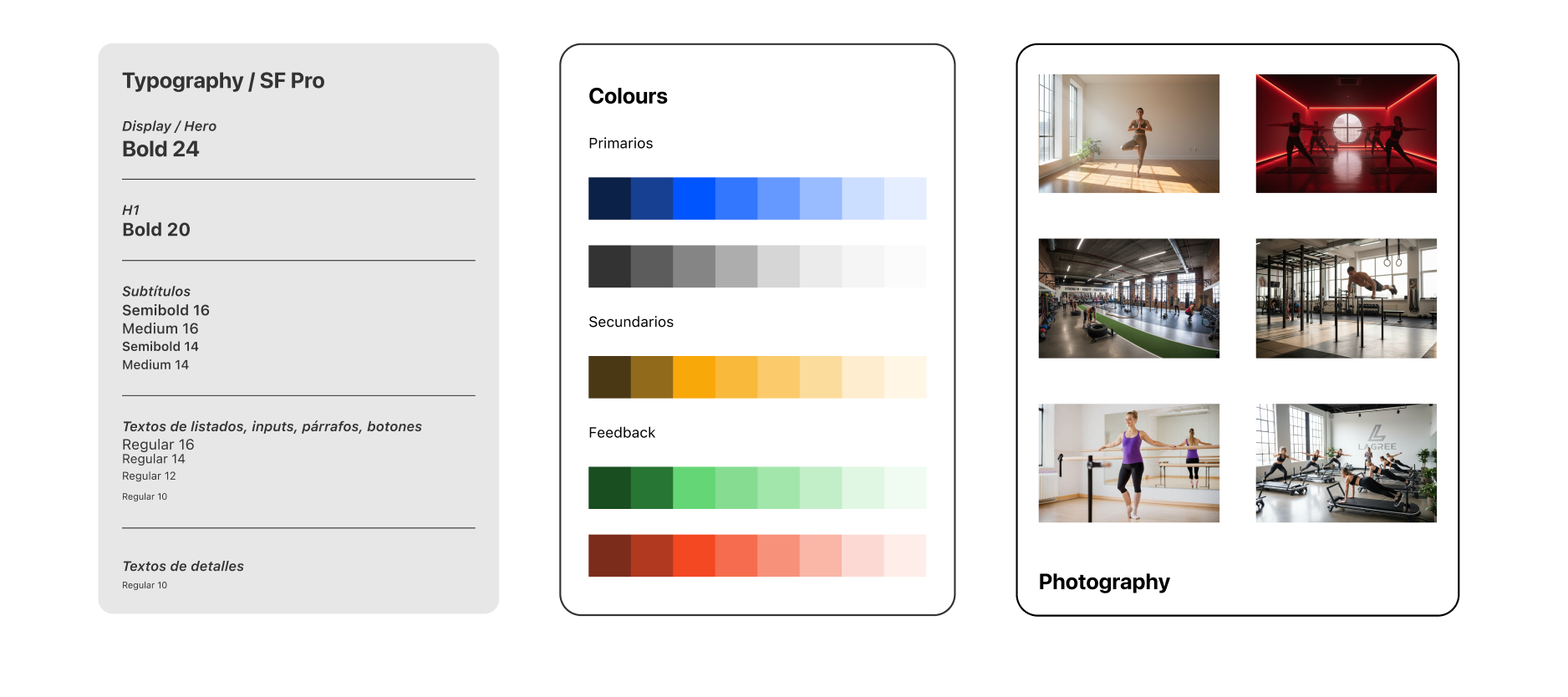
Atomic Design